{ CSS } Flex Box
FlexBox
- why do we need flexbox
Display values
- block: It does not allow locate any elements next to it.
- inline - Loses all of attributes in a block = there is no width & height.
-
inline-block - Keeps being a block and put boxes next to each other.
problem: it creates the unexpected margins between elements = you should calculate the layout.
- flex - Flexbox, it solves the problem of inline-block
- first rule of flexbox
- Flexbox does not talk to children.
- If you want to move something in a flexbox, you have to create a flexbox container.
- box’s parent is a container, and they should be direct children (adjusted).
(Note that we are not coding anything about boxes)
...
<div class="wrapper">
  <div class="child">1</div>
  <div class="child">2</div>
  <div class="child">3</div>
  <div class="child">4</div>
  <div class="child">5</div>
  <div class="child">6</div>
</div>
.wrapper {
  display: flex;
}

.box {
  width: 200px;
  height: 200px;
  background: peru;
  color: white;
}
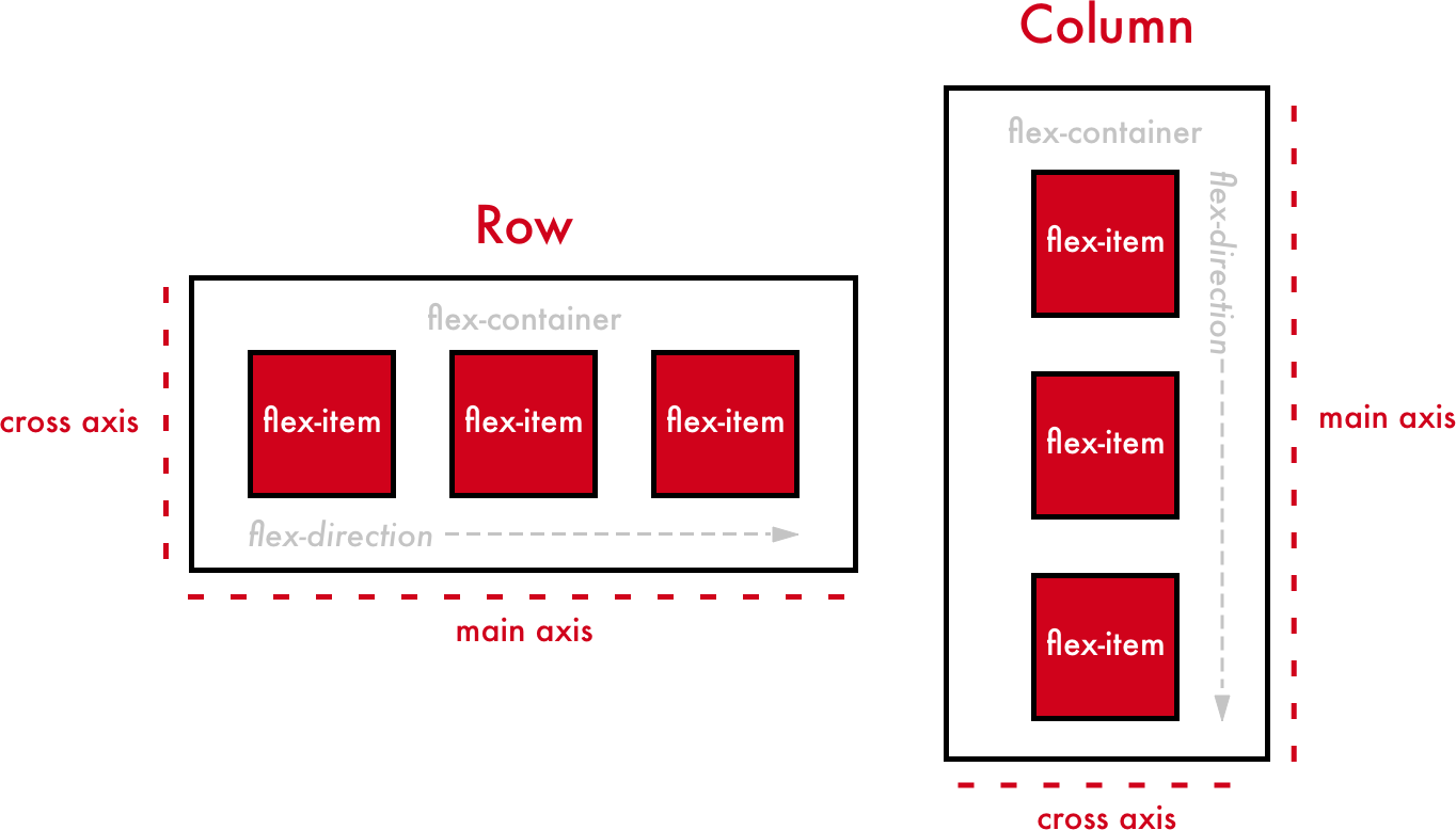
- main axis & Cross Axis
- default flex-direction is ‘row’.
- If, flex-direction is row,
- justify-content: changes the location of children with ‘main-axis’ direction.
- align-items: changes the location of children with ‘cross-axis’ direction.
- flex-direction is column,
- main-axis => vertical, cross-axis => horizontal.
justify-content values
- space-between: Distribute items evenly. The first item is flush with the start, and the last is flush with the end.
- space-around: Distribute items evenly Items have a half-size space.
align-items values
- stretch: fill whole full height of an element til wrapper height.
- align-self and order
properties for children
- align-self : cross-axis but only for a children.
- order : default order is ‘0’, useful when you are not allowing to modify html due to some reasons.
- wrap, nowrap, reverse, align-content
wrap & nowrap
- Even if a browser size is shrinked, flex property allows you to align children in the same line.
- It means flex property changes the width of children automatically.
- flex-wrap determines how you deal with the width of child.
flex-wrap values
- wrap: Respect the width of child.
- nowrap: Disregard the width of child.
reverse
flex-direction values
- row-reverse: reverse row order (right side is starting with 1)
- column-reverse: reverse column order (bottom side is starting with 1)
- flex-wrap: wrap-reverse; wrap but, cross-start and cross-end are permuted.
align-content & justify-content
- Both plays a role in adjusting spaces between elements.
- align-content: Align lines within the flex container when there is ‘extra space’ in the cross-axis.
- justify-content: Align individual elements within the main-axis.
- flex-grow & flex-shrink
- flex-grow, flex-shrink are properties that we can give to child
- They are useful when we do responsive design.
- flex-shrink : When the width OR height of elements is shrinked, an element is shrinked more than other elements by ‘given value’.
- e.g. a box is shrinked ‘two times more’ than other elements if given value is ‘2’ (Default value: 1)
- flex-grow : When there is some remaining space between elements, the space is taken by an element (Default value: 0)
flex-basis
- flex basis is the initial size for elements ‘before’ an element is expanding or growing or shrinking.
- flex is changing the size of elements on main-axis.
- width when flex-direction is row.
- height when flex-direction is column.
Review (Korean)
justify-content
- flex-start: 요소들을 컨테이너의 왼쪽으로 정렬.
- flex-end: 요소들을 컨테이너의 오른쪽으로 정렬.
- center: 요소들을 컨테이너의 가운데로 정렬.
- space-between: 요소들 사이에 동일한 간격.
- space-around: 요소들 주위에 동일한 간격.
aligh-items
- flex-start: 요소들을 컨테이너의 꼭대기로 정렬.
- flex-end: 요소들을 컨테이너의 바닥으로 정렬.
- center: 요소들을 컨테이너의 세로선 상의 가운데로 정렬.
- baseline: 요소들을 컨테이너의 시작 위치에 정렬.
- stretch: 요소들을 컨테이너에 맞도록 늘림.
flex-direction
- row: 요소들을 텍스트의 방향과 동일하게 정렬.
- row-reverse: 요소들을 텍스트의 반대 방향으로 정렬.
- column: 요소들을 위에서 아래로 정렬.
- column-reverse: 요소들을 아래에서 위로 정렬.
reverse 를 사용하면 start 와 end 의 순서도 바뀐다.
.boxes {
  flex-direction: row-reverse;
  justify-content: flex-end; // 오른쪽이 아닌 왼쪽 정렬이 된다.
}

.boxes_2 {
  flex-direction: column-reverse;
  justify-content: flex-start; // 위가 아닌 아래 정렬이 됨.
}
order 를 사용하면 elements 들의 순서를 바꿀 수 있다
- order의 기본 값은 0이며, 양수나 음수로 바꿀 수 있다.
align-self는 개별 요소에 적용할 수 있는 또 다른 속성
- 이 속성은 align-items가 사용하는 값들을 인자로 받으며, 그 값들은 지정한 요소에만 적용
flex-wrap
- nowrap: 모든 요소들을 한 줄에 정렬.
- wrap: 요소들을 여러 줄에 걸쳐 정렬.
- wrap-reverse: 요소들을 여러 줄에 걸쳐 반대로 정렬.
flex-flow
- flex-direction과 flex-wrap이 자주 같이 사용되기 때문에 이 둘을 대신 할 수 있는 속성.
- 두 속성의 값들을 인자로 받음.
- flex-flow: row wrap; 요소들을 가로선 상의 여러줄에 걸쳐 정렬.
- flex-flow: column wrap; 요소들을 세로선 상의 여러줄에 걸쳐 정렬.
align-content
- 여러 줄 사이의 ‘간격’ 을 지정
- flex-start: 여러 줄들을 컨테이너의 꼭대기에 정렬.
- flex-end: 여러 줄들을 컨테이너의 바닥에 정렬.
- center: 여러 줄들을 세로선 상의 가운데에 정렬.
- space-between: 여러 줄들 사이에 동일한 간격.
- space-around: 여러 줄들 주위에 동일한 간격.
- stretch: 여러 줄들을 컨테이너에 맞도록 늘림.